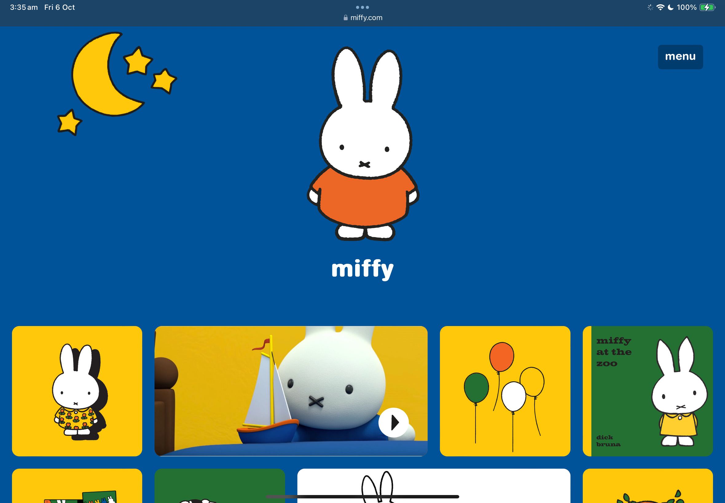
I chose the Miffy Website as it has many interactive and unique elements. Unlike most websites, its home page is full of extensions to certain content for children to play, rather than a shop or introduction. To find what you are actually looking for you would need to use the menu in the top right, but most people likely will just use the interactive features on the front.
The Miffy website went for a friendly approach, using a bubbly typeface and simple design. These were all strategically used as it is a website for mainly children. Simple but bold colours are eye catching and suits Miffys persona and brand.
There is a voice that plays when you click on anything (including the Home Screen Miffy), which is an interactive feature to keep people listening and engaging with the website. Each square represents another game, video or element that they are trying to showcase. The actual shop for Miffy has a 360° view of the physical store, which is another interactive element they have added to keep people engaged.
The layout is strategically positioned so that Miffy is the one introducing her own brand at the top, and as you scroll there is squares with rounded corners with pictures. It is created like this to make a direct connection to the Miffy picture books.