Jonathan Herring
Branding | Photography | Typography
http://www.indeepdesign.com/portfolio/
Jonathan Herring, 21 from western Sydney. I grew up in a household full of creative influence, and from a young age was drawn to creativity, it was only natural that I pursued the calling of design.
I am a creative individual, energized by the idea of designing purpose. My current studies of graphic design, as well as my experiences of working in the field as an intern, have taught me the importance of intentional design, this is something I bring forward into new exciting problems.
As a graphic designer, my goal is bring forward this meaning through my work.
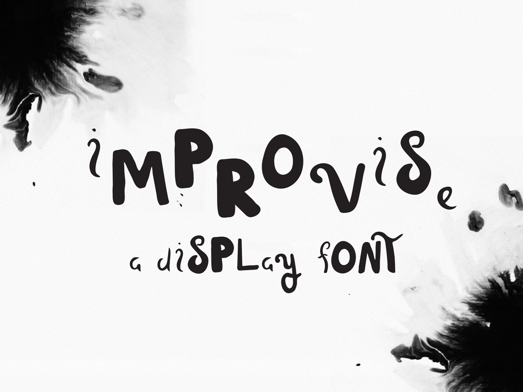
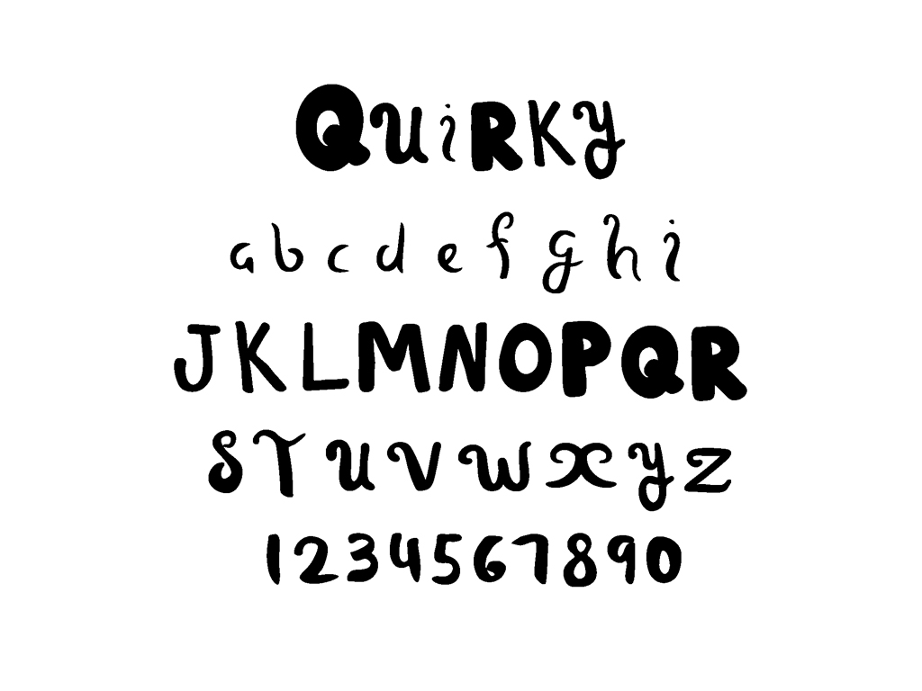
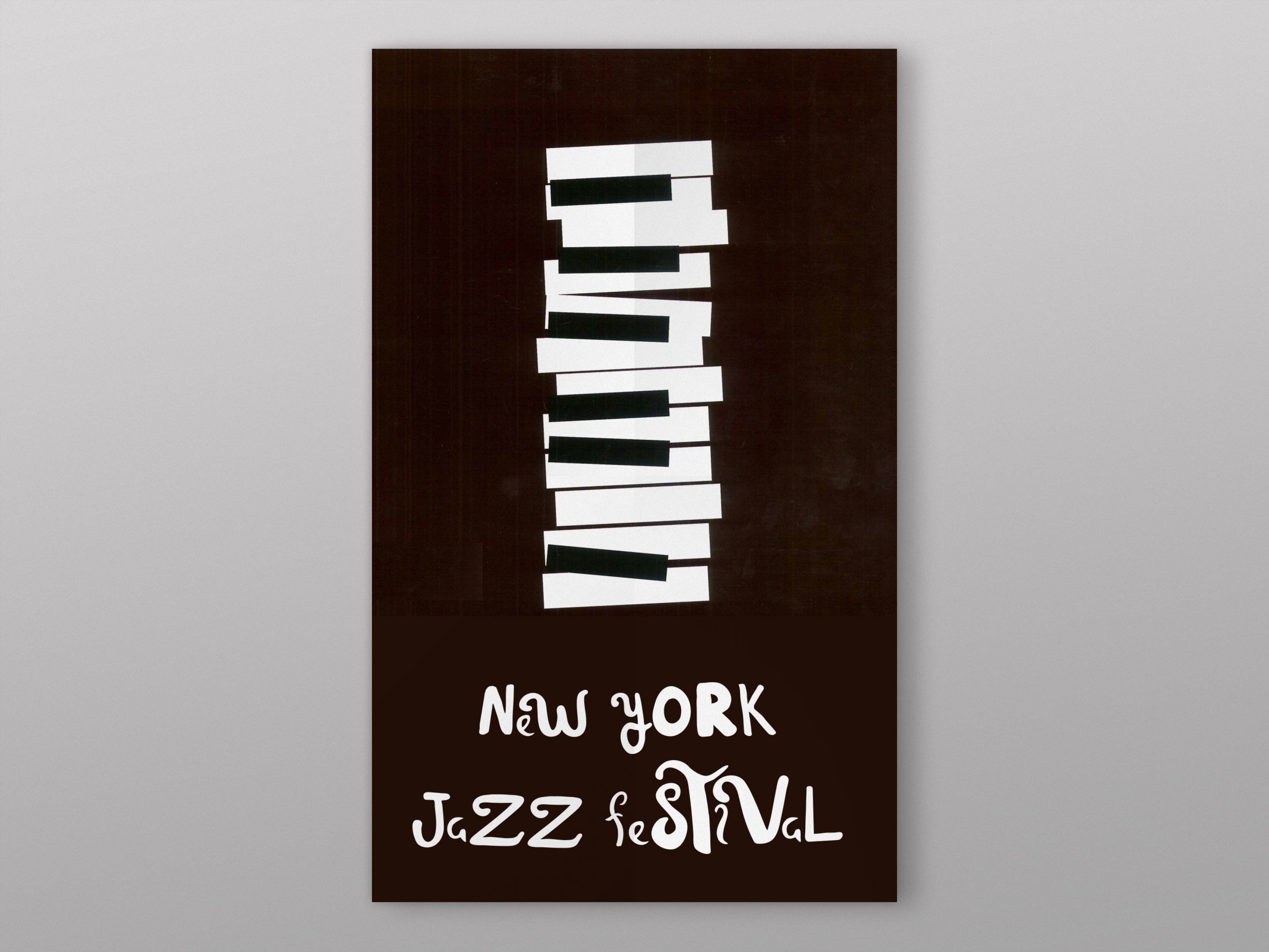
Improvise
As a display typeface, Improvise aims to be unquestionably unique, not only in its letterforms but in its conception as well. Improvise was birthed out of the idea that music and typography can reflect one and the other, and so was developed as a representation of a composition of music. This typeface encapsulates the entirety of a musical composition, its dynamics its texture and represents them as marks on a page in the form of a typeface. The result being a very interesting combination of lettering, that when used together bring some ‘quirky’ and intriguing wording.
Improvise
Improvise
Improvise

White Poppy

Nepean Creative Arts
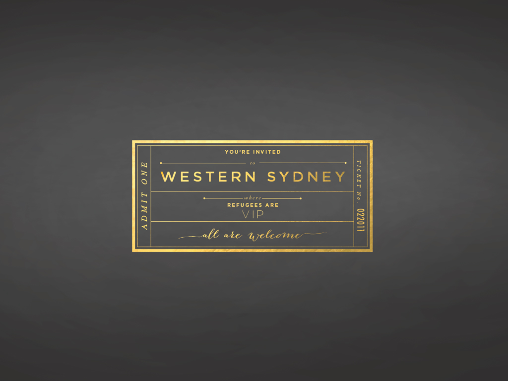
Refuge